

Apple Music’s Black-and-White App Icon Sparks User Backlash
The move to a monochrome icon arrives with iOS 27.2, trading a decade of red branding for the new Liquid Glass interface.
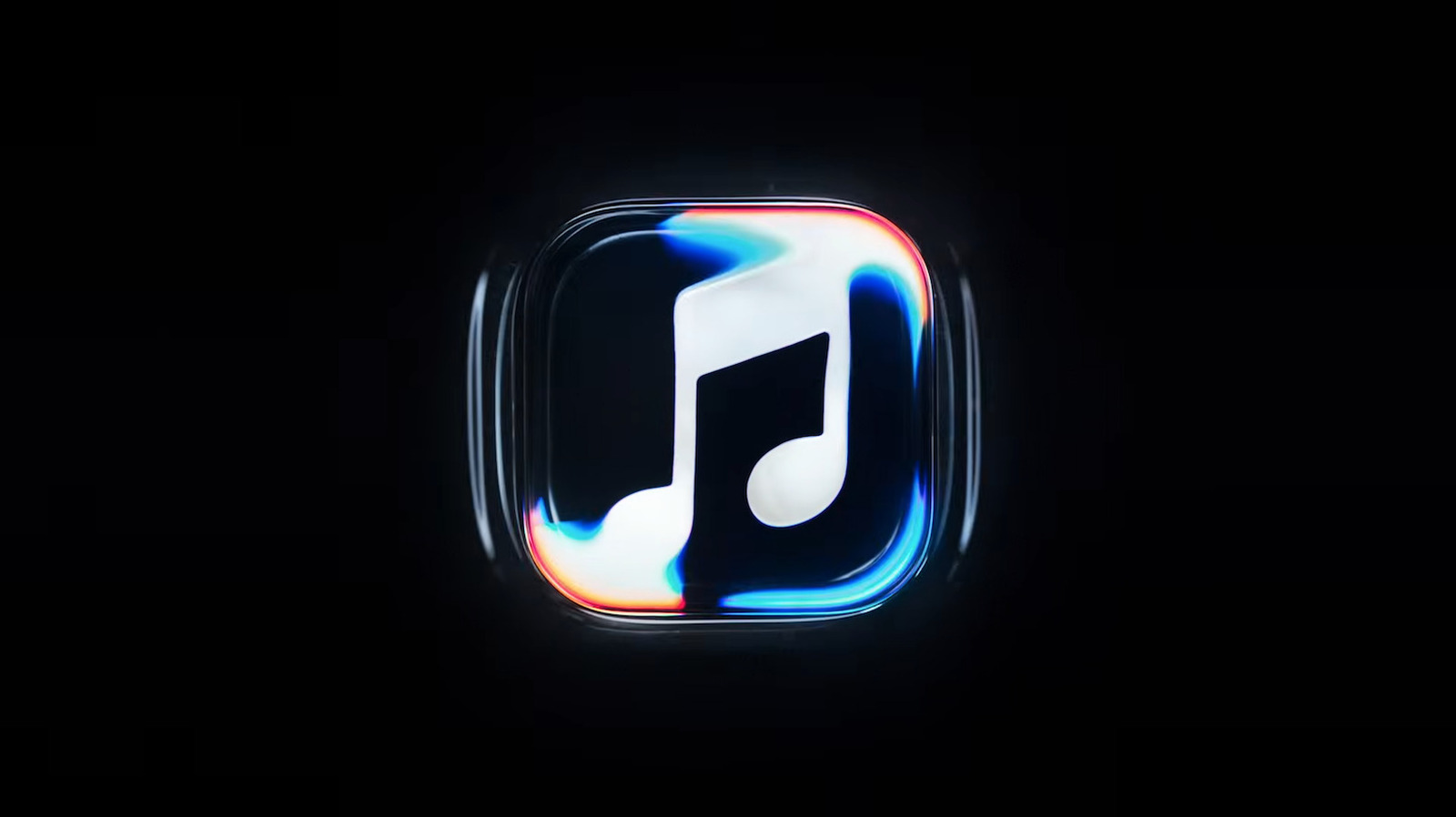
The shift from Apple Music’s signature red app icon to a black-and-white design is drawing sharp criticism from users online, overshadowing the broader visual overhaul the company announced alongside its upcoming software updates.
Consumers have grown accustomed to color-coded home screens on iOS devices. Red has anchored the music streaming application since its launch in 2015, replacing the multicolored iTunes logo during Apple’s transition away from digital media ownership toward subscription streaming. Stripping that color out disrupts a decade of visual muscle memory for millions of subscribers navigating their devices daily.
The monochrome icon will arrive with the release of iOS 27.2 and macOS 27.2, according to the company. It aligns the streaming service with Apple’s new Liquid Glass interface language, which relies heavily on translucency and light refraction rather than solid blocks of color across system applications.


While the static icon loses its color, video content receives a more elaborate treatment. Apple confirmed it developed an animated logo intended for use at the beginning of Apple Music videos and concert footage. The animation depicts a musical note floating beneath rippling waves.
Producing that specific ripple required physical engineering rather than digital rendering. According to the company, crews etched the logo onto the glass floor of a small tank, filled the basin with mineral oil, and sealed it under a transparent cover. An instrument then played a short series of tones to force the oil into motion while cameras recorded the result.
Music producer Fred Again and NEST Acoustics collaborated on the project. “For the rebrand of Apple Music, we wanted sound to create the visuals,” a narrator states in an introduction video released by the company. “How do we take this idea of music and distill it into something visually beautiful? Essentially the idea was to create the perfect sound wave.”
The backlash over the grayscale icon highlights a recurring tension in consumer technology. Interface unification efforts frequently clash with established brand recognition. When competitors like Spotify maintain distinct, high-contrast branding across platforms, a muted palette risks making an application feel generic to casual users scanning a crowded screen.
Apple last executed a major branding pivot for its music platform in 2015, retiring the iTunes name and rainbow motif entirely to push Apple Music as a standalone streaming competitor. That transition took several operating system cycles before user frustration subsided. The current rollout targets the same installed base ahead of the iOS 27.2 and macOS 27.2 deployments.