
5 Bold Colors That Pair With Yellow, According to Designers
From color-drenched butter walls with red trim to complementary electric blue accents, designers explain how to balance saturation and texture.
Interior designers are abandoning the long-held rule that yellow walls require white trim and beige furniture to remain livable. Across residential projects in 2026, professionals are pairing butter, ochre, canary, and mustard shades with saturated hues — from electric blue to tomato red — using color theory and material contrast to prevent spaces from feeling chaotic.
The shift reflects a broader movement away from the all-neutral interiors that dominated the early 2020s. As homeowners increasingly treat paint as an architectural element rather than a passive backdrop, yellow has emerged as a testing ground for high-contrast palettes. The challenge lies in managing saturation. A school-bus yellow paired with an equally aggressive secondary color causes visual vibration, while softened, chalkier versions of bold pigments create tension without fatigue.
**Anchoring Ochre With Burgundy and Plum**

Warm-on-warm combinations rely on shared undertones to maintain cohesion. Deep ochres anchored by burgundy or dark plum furnishings produce a cocooning effect frequently deployed in bedrooms, where restfulness is the primary design objective. Interior designer Jenny Luck notes that the similar depth of these warmer undertones prevents either shade from overpowering the other.
Because both colors carry significant visual weight, texture becomes the differentiating factor. Smooth plaster finishes against heavy velvet upholstery, or matte wall paint paired with polished burl wood nightstands, introduce the necessary contrast. Without varied materiality, two deeply saturated warm tones risk flattening a room into a single, indistinguishable mass.
**Butter Yellow and Tomato Red Trim**
Architectural detailing offers a controlled method for introducing aggressive pairings. Designer Daniela Araya recently wrapped a living room in soft butter yellow, reserving a vibrant tomato red exclusively for window trim. Color-drenching — painting walls, ceilings, and built-in shelving in a single hue — turns a pale yellow into an enveloping neutral, creating a calm baseline that allows a fire-engine red accent to deliver punch without overwhelming the eye.
This technique traces its roots to mid-century modernism and 1980s postmodern architecture, where unexpected trim colors were used to redefine spatial boundaries. Balancing saturation across the room remains critical; if the base yellow leans too bright, the red trim loses its structural purpose and devolves into visual noise.
**Mint Green and Mustard in Wet Rooms**
Despite the Victorian-era adage warning against wearing or displaying green and yellow together, contemporary designers exploit their proximity on the color spectrum. Because they sit adjacent to one another, they share an inherent harmony that makes them difficult to clash, provided the values are calibrated correctly.
Design studio Owl Design applied this logic to a small bathroom, using mint green square wall tiles as the dominant surface and inserting mustard yellow within a shower recess. Sophie van Winden, a designer at the firm, emphasizes that slightly softened variations of these colors prevent the scheme from skewing juvenile. In compact spaces like powder rooms, where natural light is often limited, cool mint balances the warmth of mustard, generating energy without requiring large square footage to breathe.
**Electric Blue as a Complementary Counterpoint**
For maximum luminosity, designers turn to the color wheel. Yellow and deep blue sit almost opposite each other, meaning their simultaneous presence forces the human eye to perceive both at peak intensity. Isabelle Heilmann, founder of the design studio Épicène, utilized lemon yellow cabinetry alongside an electric blue table base in a kitchen inspired by 1980s Memphis Group aesthetics.
Proportion dictates success in complementary schemes. Heilmann surrounded the dominant yellow with a tonal layer of softer warm materials — apricot flooring, pink terrazzo countertops, and honey-toned oak — while restricting the electric blue to isolated accents repeated just enough to register as intentional. White walls and ceilings serve as essential negative space, giving the eye a place to rest between high-frequency color interactions.
**Caramel and Earthy Yellows**
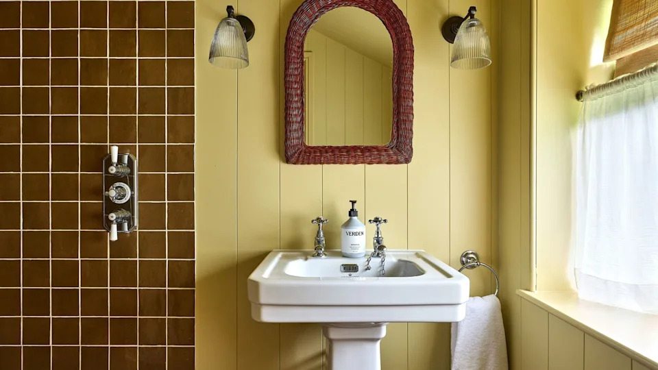
When a sophisticated, grounded aesthetic is required over pure vibrancy, caramel provides a tonal bridge. Color consultant Harriet Slaughter points out that yellow and caramel share golden undertones, but warns that matching them at identical depths produces a dated, monochromatic effect reminiscent of 1970s bathrooms.
The solution requires manipulating value. An earthy, muted yellow on paneled walls paired with richer, darker caramel tiles establishes hierarchy. Introducing crisp white porcelain fixtures and dark reddish wood elements breaks up the warmth, ensuring the palette reads as deliberate and contemporary rather than accidental. This approach aligns with the current industry preference for “warm minimalism,” where neutrality is achieved through closely related earth tones rather than stark grays.
Ochre remains the most requested yellow variant among trade professionals this year, favored for its ability to function as a moody neutral that accommodates heavier accent colors than its paler counterparts.