

Coca-Cola’s Global Typography Refresh Sparks Viral Marlboro Comparisons
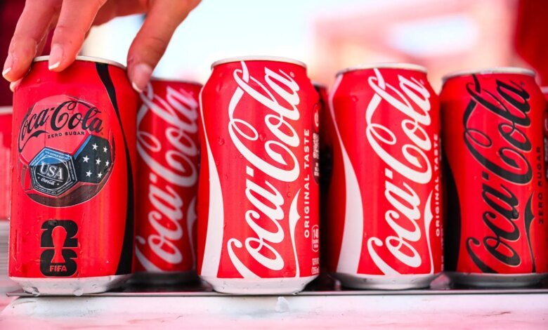
Coca-Cola’s latest initiative to standardize its visual presentation across more than 200 international markets has drawn unprompted social media comparisons, with consumers pointing out aesthetic similarities between the soda giant’s updated typography and the iconic lettering of Marlboro cigarettes.
The visual overhaul was conceived as a global streamlining measure aimed at unifying packaging and typography worldwide. According to Arnab Roy, president of Coca-Cola Global Category, the update seeks to achieve clearer and more consistent visual communication across retail and digital touchpoints.
“This refresh is about being clearer and more consistent in how we show up, wherever people experience our brand,” Roy said in a statement accompanying the rollout. “By building on the things people already know and love, we’re creating a stronger foundation for growth while staying unmistakably Coca-Cola.”
Managing unified visual systems across hundreds of territories represents a recurring challenge for fast-moving consumer goods conglomerates. Coca-Cola has periodically adjusted its design language since the late 19th century, leveraging elements such as its signature contour bottle shape and the white “Dynamic Ribbon” wave introduced in landmark refreshes to maintain global recognition.
The timing of the current font update intersected unexpectedly with an established online meme. On platforms like TikTok and X, younger consumers routinely refer to an afternoon soda break—often a Diet Coke—as a “fridge cigarette” or “crispy ciggy.” The viral phrasing was popularized in 2025 by content creator Rachel Reno and quickly became embedded in digital slang. For many online observers, Coca-Cola’s new lettering appeared to unintentionally lean into the joke by mimicking famous tobacco branding.
Craig Heyne, vice president of performance marketing at Bloom Nutrition, noted that soda rituals have gained traction alongside the cultural trend of seeking daily micro-indulgences or “sweet treats.” As remote and hybrid work patterns altered routine schedules, taking a short, dedicated moment for a chilled beverage emerged as a widespread workplace coping mechanism and personal ritual.
Industry analysts point out that intense public scrutiny over minor design changes is common for legacy corporations. Allen Adamson, cofounder of brand strategy firm Metaforce and former executive at design agency Landor—where he worked on Coca-Cola’s major global visual system redesign in the late 1980s—explained that brand identity updates are essential to prevent heritage products from quietly appearing outdated.
Adamson emphasized that while consumers often isolate individual design choices during a redesign, a brand’s true identity relies on a far broader ecosystem of visual cues and historical associations. Success in modern brand strategy requires constantly evaluating how visual systems perform across evolving packaging formats and digital environments.
“A font isn’t a brand,” Adamson observed, adding that active debate among consumers ultimately demonstrates high brand engagement, as audiences rarely spend time analyzing design choices for companies they hold no connection to.