
Red Kitchen Design Trend Replaces White Cabinets in 2026 Homes
Architects specify deep burgundies and historic pigments as homeowners abandon the all-white minimalist aesthetic
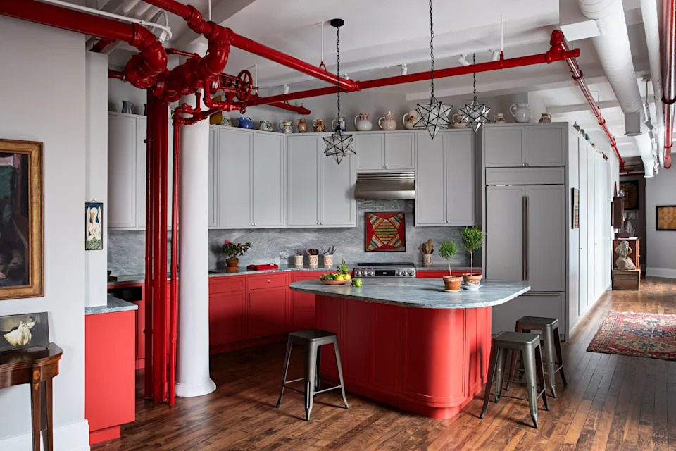
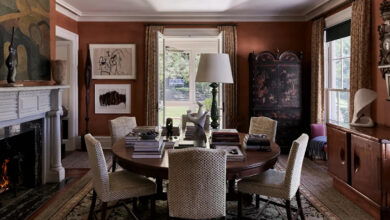
Interior designers across the United States and Europe are abandoning the all-white kitchen, replacing sterile cabinetry with deep burgundies, brick tones, and cherry reds. The shift marks a definitive end to the minimalist gray-and-cream aesthetic that dominated residential architecture for more than a decade, driven by homeowners demanding spaces with distinct architectural character rather than resale-neutral safety.
New York-based firms including Lichten Architects and Opa Architecture are leading the transition. Kevin Lichten of Lichten Architects attributes the pivot to a broader cultural fatigue with compromise in residential design. Aria Jahanshahi of Opa Architecture notes that as open-concept floor plans have permanently merged cooking areas with living rooms, kitchens now function as primary gathering hubs rather than isolated utility zones, requiring a visual weight that matches their centrality in daily life.
The psychological mechanics of the color explain its historical dominance in commercial food service. Red stimulates appetite and elevates heart rate, a principle fast-food chains like McDonald’s, Wendy’s, and Kentucky Fried Chicken have exploited in branding since the mid-20th century. Despite the recent proliferation of GLP-1 weight-loss medications such as Ozempic altering consumer relationships with food, architects report no hesitation among clients regarding appetite-stimulating colors. The modern kitchen serves as an informal social anchor where families plan schedules and decompress, making emotional resonance a higher priority than dietary psychology.

Executing the trend requires precise shade selection. British interior designer Uns Hobbs favors deeper, traditional pigments over bright tomato hues, recently specifying deVOL’s Refectory Red to achieve a historically grounded aesthetic. For brighter applications, Lichten warns against synthetic-looking paints, recommending Benjamin Moore’s Red Parrot for its earthy, organic undertones. Another frequently specified option is Benjamin Moore’s Classic Burgundy, which Opa Architecture recently applied to a city apartment’s kitchen peninsula to anchor the space without overwhelming adjacent rooms.
Historically, red kitchens carry significant American precedent. During the 18th and 19th centuries, rural homes frequently featured barn-red or Indian-red kitchens because iron oxide pigments were inexpensive, durable, and believed to possess antimicrobial properties. The current movement draws heavily on this Victorian and colonial vocabulary, treating red not as a novelty but as a restoration of domestic heritage.
Material pairing determines whether a red kitchen reads as sophisticated or aggressive. Proportion remains the critical variable. Lichten grounds his projects with bold lower cabinets while installing muted gray uppers to preserve visual breathing room. Hobbs balances scarlet elements with warm neutrals such as Farrow & Ball’s Oxford Stone.
Texture provides necessary counterweight to the high-energy pigment. Jahanshahi emphasizes that supporting materials soften the intensity of the dominant tone. Granite, unlacquered brass, marble countertops, and natural wood flooring absorb light and prevent the space from feeling flat. Vintage ceramics and art introduce irregular patterns that further temper the saturation.
The departure from white kitchens aligns with a wider industry turn toward maximalism and saturated color in 2026. After years of Scandinavian-inspired minimalism dictating real estate staging and renovation standards, architects report that buyers increasingly view neutral palettes as unfinished rather than move-in ready. Paint manufacturers have responded by expanding historic color collections, making complex, multi-tonal reds more accessible for residential specification.